
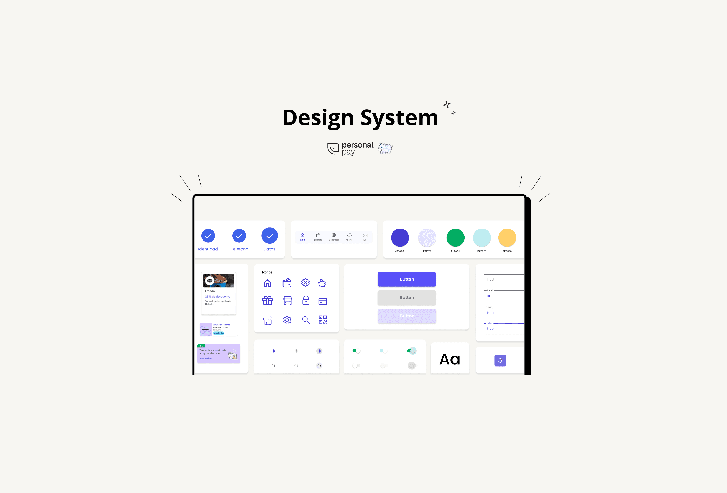
This project is a part of the UI Design course at Coderhouse. We're taking a close look at Personal Pay, an existing product, to learn how it works inside and out. Our main aim is to create a Design System that fits perfectly with what the business wants and what the brand stands for. Plus, we're thinking ahead – we want this Design System to be able to grow and change along with the product in the future, just in case we need to add more features or make improvements.
This project is a part of the UI Design course at Coderhouse. We're taking a close look at Personal Pay, an existing product, to learn how it works inside and out. Our main aim is to create a Design System that fits perfectly with what the business wants and what the brand stands for. Plus, we're thinking ahead – we want this Design System to be able to grow and change along with the product in the future, just in case we need to add more features or make improvements.

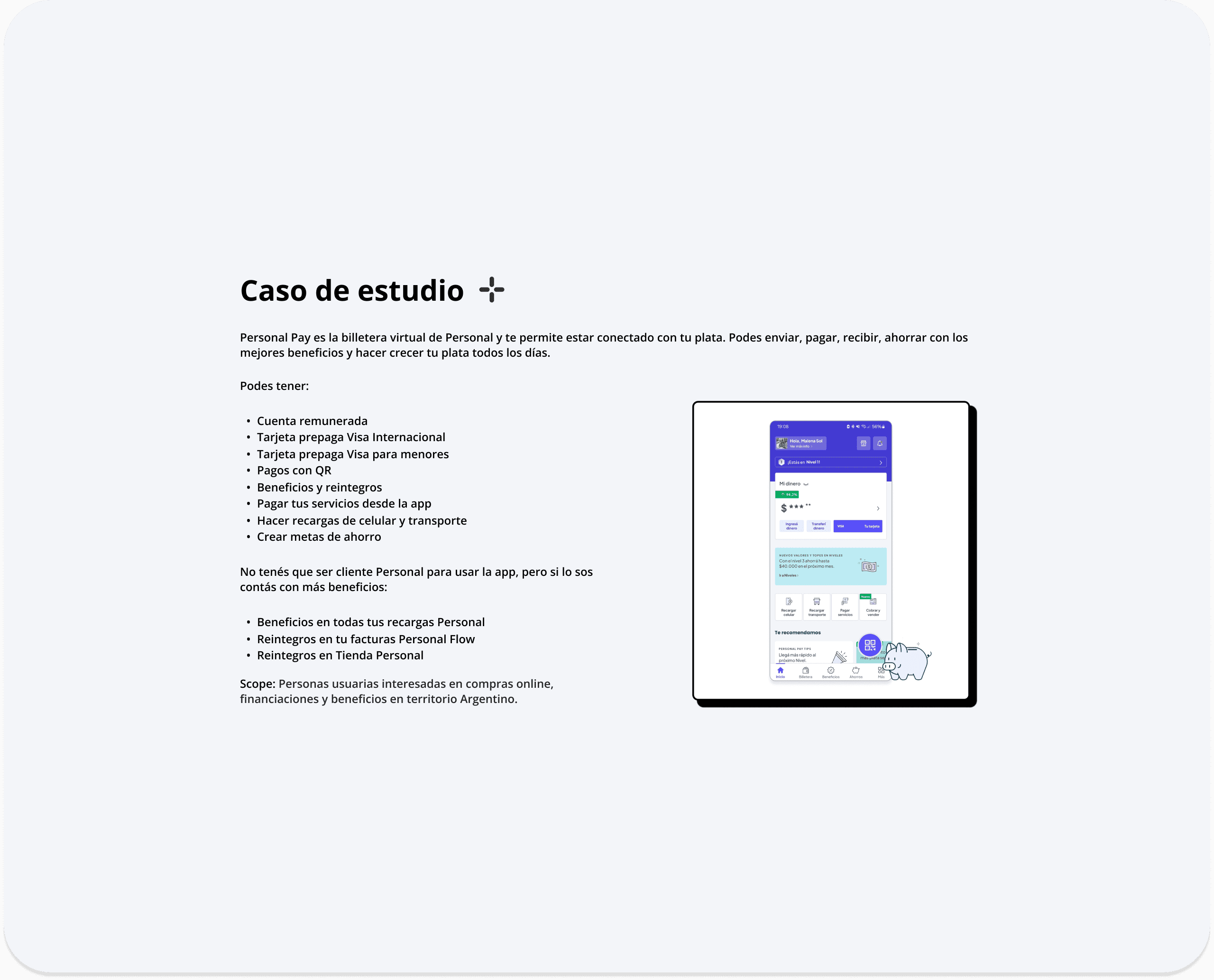


Throughout the research, we found an app that's easy to use and mostly meets users' needs, but it has various problems with its features. There's confusion when making transfers or payments, the interface is clear but messy, titles and elements aren't the right size, there are too many colors in its brand guide, and there are accessibility issues because the contrast between background and titles doesn't follow WCAG rules.
Throughout the research, we found an app that's easy to use and mostly meets users' needs, but it has various problems with its features. There's confusion when making transfers or payments, the interface is clear but messy, titles and elements aren't the right size, there are too many colors in its brand guide, and there are accessibility issues because the contrast between background and titles doesn't follow WCAG rules.
Contact
Let's start creating together
Contact
Let's start creating together
Contact